Overview:
Just a Plane Dashboard is a responsive web application (both desktop and mobile) that provides real-time flight and airport information. This app aims to address the accessibility gap in how flight data is presented.

Booking, ticketing, check-in, and cross-device sync are out of the flight path.

Team:
Solo role

Role:
Product Designer

Hypothesis: Accessibility is treated as an afterthought rather than a constraint
Experiment: Just a Plane Dashboard that presents data accessibly

Observation

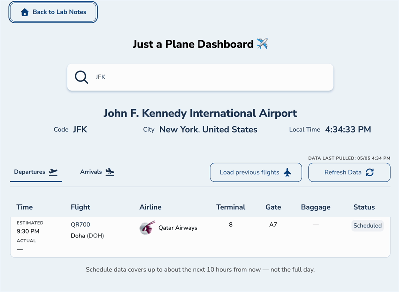
As a frequent traveler, and aviation enthusiast, I've noticed that flight data is presented so differently across airports. Each has their own method of presenting flight information, all include the same critical information (flight number, arrival/departure time, airline, status, gate). Yet, the way this information is presented varies, and is not always accessible.

For such a large industry, there needs to be a centralized and accessible manner for users to receive the information they need. Whether it’s to keep up with one’s flight, pick up a loved one, or simply enjoy flight data, everyone deserves access to information.

Gather Background Info

Market Research

Commercial aviation is one of the fastest growing industries in the consumer market. According to OAG, there was a ~2.9% increase in the busiest day for air travel in 2025, surging from 19.2M to 19.8M passengers. Airline companies too, have been investing in growth, with Bain and Company predicting a 2.4% growth annually in airline fleet size.

Airport Research

I conducted a design and accessibility audit on 6 of the busiest airports (3 global hubs: ATL, DXB, HND; 3 domestic: DFW, ORD, DEN)
For the accessibility audit, I used the WAVE Evaluation Tool and axeDevTools, and tabbed throughout the site to ensure that elements and key information is tabbable and reachable.
After running the audit and gathering notes, I was able to find patterns throughout all airports for both design and accessibility patterns. Although I found some that balanced visuals with functionality well (DXB), and others that did not (ATL), not one airport could allow users to fully achieve its function in both desktop and mobile while maintaining accessibility.

Pattern 1: Information Overload

Unnecessary visual noise: Tables repeat column headers in rows, field labels clutter every entry, and unnecessary information (codeshare animations, color theme overlays) add visual noise without helping users.

Pattern 2: Control Placement Matters

Arrival/Departure toggles vary wildly: sometimes above the table (ORD), sometimes in the search bar far from data (ATL). Users have to hunt for controls (HND).

Pattern 3: Mobile ≠ Scaled Desktop

Most airports degrade on mobile: missing fields (ATL drops codeshare), table headers disappear (DEN repeats labels per card), data doesn't load without a secondary action (ORD), airlines get replaced by logos (DXB).

Pattern 1: Keyboard Nav Missing/Broken

Keyboard-only users are blocked from core features.Many airports fail keyboard navigation: ATL's accessibility button isn't tabbable, ORD's flight entries aren't keyboard-reachable, DFW has no visible focus indicators.

Pattern 2: Tables Semantically Unclear

Generic table semantics don't convey flight-specific context. Most airports lack comprehensive row labels. Contrast errors are rampant (WAVE shows 97 errors at HND, 37 at ORD, 21 at ATL).

Pattern 3: Inaccessible Accessibility

ATL's built-in accessibility menu creates more errors rather than fixing them. The airport has a built-in accessibility menu (screen reader, text sizing, translation, color themes) but the menu button itself isn't tabbable, and color themes actually add contrast errors instead of fixing them (4 errors after applying theme).

Create a Hypothesis

If accessibility is treated as a structural design constraint from the start rather than a compliance checklist applied at the end, then flight information interfaces can meet WCAG standards without sacrificing visual hierarchy or scannability.

Test Hypothesis

Design Pattern Decisions

Information Hierarchy

The design patterns discovered in the auditing process influenced the  decisions made regarding information hierarchy:
  1. Show only essential fields: Flight, airline, time, status, gate/terminal/baggage. No unnecessary animations or repeated labels. One flight = one readable unit.
  2. Controls adjacent to data affected: Controls should be next to the data it affects. Tabs are above the flight schedule, not hidden in navigation. Data refresh is above the table.
  3. Mobile design should be intentional: Fields scale logically, and core fields should always be visible. There should be the same data, just with a different presentation.
I also styled the mobile cards so that they look like paper boarding passes with primary flight info on the left, logistics on the right, which organically echoes a boarding pass structure.

Style Sheet

I wanted a sleek, professional, and legible typeface - so I opted for a Neo-Grotesque sans serif font. One of the key criteria is legibility, can users differentiate between capital I, lowercase l, and 1? If not, then no. Does the typeface have italic fonts? If not, then it’s also not an option.
I ended up choosing Nunito Sans. It was consistent throughout both italic and regular styles, and had a touch of personality that I liked.
As for the brand color, I aimed to revolve around blue (#2F5781). It is professional, calm, and trustworthy choice. I also associate blue with speed, and it’s not a farfetched association either - JetBlue, United, KLM use blues in branding. Blues along with greys and a white background make for the basic color palette used.
Just A Plane Dashboard in Mobile view showing entries for JFK. Page shows flights for arrivals from Los Angeles and Stockholm.

Accessibility Pattern Decisions

Implementation

As I was implementing the site using Cursor, it was imperative that the accessibility patterns discovered in the audit were addressed:
  1. Keyboard Navigation Required: All interactive elements tabbable in logical order. Clear, visible focus states on all focusable elements. Airport section, flight entries, controls all reachable via Tab key.
  2. Semantic Correctness: Comprehensive label per flight (code, route, airline, times, terminal, gate, status). Proper contrast ratios (WCAG AA minimum). Real semantic tabs (not links pretending to be tabs).
  3. Accessibility is structural: High contrast built into the default design. No color themes that introduce new accessibility problems. Focus on semantic HTML, not overlay features.
Gif of desktop site being tabbed and switched from departures to arrivals.

Analyze Results

Accessibility Audit

After implementing designs from Figma to Cursor, and connecting with AirLabs API, it was time to run an accessibility audit using MacOS and iOS VoiceOver to find gaps between design markups and actual screen reader experience.
Now, keyboard users can navigate airport + flight info in logical order. Screen reader users hear complete flight context (one announcement per row/card, no repetition). Time information is stable (minutes accessible, seconds visual). URLs shareable. Desktop and mobile feel consistent in accessibility, even with different visual presentation.
What VoiceOver heard: Clock re-announcing every second ("4:32:30 PM, 4:32:31 PM, 4:32:32 PM...")
Why: aria-live="polite" aria-atomic="true" on the clock.
Fix: Removed live region. Added stable minute-only label via composite aria-labelledby. Seconds appear only in visual time.
What VoiceOver heard: Generic row/card announces like "Row 1, UA456, Chicago", missing flight context. Mobile especially suffered: each element had to be tapped individually to be announced.
Why: No comprehensive flight label.
Fix: Created flightSrSummary() utility that generates one label: flight, codeshare, route, airline, estimated/actual times, terminal, gate, baggage, status.
  • Desktop: Each <tr> gets aria-label={flightSrSummary(...)} + tabIndex={0}.
    One focus = full row.
  • Mobile: Each <article> card gets the same label. Inner fields are aria-hidden so one card = one announcement (matching desktop experience).
Initially: Used <a> for Arrivals/Departures toggle. Query params navigate, so it seems 'okay'.
Problem: Feedback pointed out that <a> should lead to pages, not UI toggles. Plus, the pattern is tabs, users expect arrow keys, not link behavior. Screen readers wouldn't announce as tabs.
Fix: Converted to semantic tabs (<button role="tab">, role="tablist">, role="tabpanel">). Kept shareable URLs via router.push(?view=arrivals|departures).
Why it matters: "Technically works" ≠ "semantically correct." Real accessibility thinking is choosing the right semantics for the pattern you're building.
What VoiceOver heard: Airport header was readable but not tabbable; felt disconnected.
Fixes:
  • tabIndex={0} to airport <section>
  • Composite aria-labelledby (name, code, city, minute-only time)
  • Skip link that focuses airport details when ?iata= is set

Considerations and Conclusions

KPIs and Future Features

  • WCAG Compliance Score: Measure the AIM score and make sure that the site is WCAG compliant. WAVE audit gives 10/10, and axeDevTools reports 0 issues.
  • Task Completion Rate (Keyboard Navigation): Measures task completion in keyboard users, and achieve 100% of core tasks as completable using keyboard/Tab key alone.
  • Mobile Accessibility Parity: Consistency between desktop and mobile assistive tech experience. Same announcement per flight (desktop row = mobile card). Keyboard navigation works on mobile. No difference in feature access.
Further development would focus on dark mode, expanded flight entry page, and search by flight.

Conclusion

This project was challenging, considering it was my first 0-1 using Figma and Cursor. While Cursor significantly sped up the process, I learned to trust my own judgement and not rely solely on agents. The design implementation was smooth, but once I looked under the hood, it was clear I needed to fix implementation accessibility-wise.
  • Research changes everything:
    A 6-airport audit took time but eliminated guesswork about what to build. Choosing the largest airports both domestically and internationally meant I looked at patterns that impacted larger audiences.
  • "Technically correct" ≠ semantically correct:
    While the tab behavior and table looked correct when implementing, audits show that they were not built correctly. The tabs used <a> elements, which are meant to direct to other pages, and the table was built with <div>. The correct elements would be <tab> and <th>/<tr> respectively. It's important that the code matches the expected behavior, even if it looks correct.
  • Device-aware accessibility is overlooked:
    Even after conducting an accessibility audit on desktop, I thought that the fixes would translate over on mobile. However, that was not the case. Mobile needs its own specifications and fixes.
That was a lot! Jump to top?