Overview:
This was a semester-long project for a class called Introduction to Digital Product Design. We were tasked with identifying a problem space and creating a solution for an existing application. I chose Gmail.

Team:
Solo role

Role:
Product Designer

Hypothesis: People lack control over what info they receive
Gmail logo
Experiment: Gmail Subscription page

Observation

Listen, I [was] a busy college student, and I can't have my time wasted. So how does Gmail get away with it?
I scroll through my Primary inbox, trying to gather important bits of information as I read the subject lines on my screen:

  • [INFO 3300] New Assignment Released
  • Cornell’s New Mechatronics Certificate
  • Score Free Delivery @ Jack’s Grill 🚗
  • 48 hours for 15% off rides
  • Laura, it’s time to book that Thanksgiving trip!

Wait... what? How is this in my Primary inbox?

I have too many subscriptions living in my inbox that have gone out of control. Some understand that their home is the (unchecked) Promotions tab, yet some sneak into my Very Important Primary inbox. Why is this so?

Gather Background Info

User Research

First, I wanted to learn the different ways in which people interact with their inbox, and manage the content they receive. From my research, I found a spectrum for how people managed their inboxes:
Unread emails at 0
Astronomical amounts of unread emails
In my user research, I was lucky to talk to users that fall in either end of the spectrum. However, I found some common patterns among all users.

Common patterns

Mainly stay in Primary inbox
Only declutter when it becomes overwhelming or necessary
Most had no idea what their Promotions tab contained

Create a Hypothesis

If Gmail users gain more control over the emails they receive, then they will be able to use Gmail more efficiently and feel less overwhelmed by their inboxes.

Defining the Problem

The problem is the lack of control they have on the information they receive. This is why inboxes that are mostly filled with emails a user can’t control are considered full of “junk” and “pointless” information because they don’t know what there is, and there is too much of it.
As a busy college student, I want to check my emails quickly so I can catch up on information. But I can’t do that well because:
  • It’s hard to know how many subscriptions you have.
  • I get overwhelmed with too much mail  in my inbox.

Test Hypothesis

Brainstorming

I led the brainstorming session with peers to ideate on solutions that would address user needs. We considered ways in which users would want to have control over their emails and thought about different user interactions that would be helpful in picking the right solution.
In the end, the solution I ended up going with was a list view of subscriptions with unsubscribing features. This specific solution would best support the features that should be implemented.

Market Research

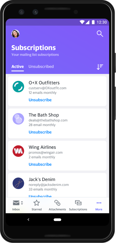
Yahoo Mail was a competitor that had a centralized subscription page. This inspired me to create something similar for Gmail. From Yahoo, I was able to think of some important features that would be useful for my own subscription page:
  • Sender's name
  • Sender's email
  • Filtering
  • Option to unsubscribe immediately
Image of phone with Yahoo subscriptions page. Page has 2 tabs: Active and Unsubscribed. Active tab is open. Tab shows multiple subscriptions with each subscription having a name, email, amount of emails monthly, and the option to unsubscribe. There is an option to filter subscriptions at the top.

Entry Points

Before deciding what the subscriptions page could look like, I first had to decide how to get to the subscriptions page itself. Here were some considerations
  • 'Unsubscribe Box': This existing feature appears when you don't open an email from a particular sender after 30 days. Fits with subscription management + shows that Gmail has an internal subscription tracker.
  • Sidebar: This entry point fits with the other email-related functions. Placement in sidebar matters for context.
  • Bottom Bar: Universally accessible. However, other products are other Google product integrations.
I ultimately went with the unsubscribe box and the sidebar entry points. The unsubscribe box is a great entry point since it deals with subscription management, and is relevant to the problem at hand. However, since it appears infrequently and is dependent on behavior (not opening emails for 30 days), there needs to be a more consistent and reliable entry point. That is why the sidebar is another entry point. It is an industry standard, and already hosts other entry points for other email-related functions.
Popup that says "Unsubscribe from Twitter? You haven't opened any emails from this sender in the last month" There are three options at the bottom: Unsubscribe, No Thanks, and Manage Subscriptions.Prototype of subscription page entry point for sidebar. Simply says "Subscription" with an icon next to it.Prototype of bottom bar from Gmail with subscriptions icon added to it. Icons are: Mail, Subscriptions, Chat, Meet, and Call.

Mid to High Fidelity

After considering the entry points, I had to update the designs to match the way Gmail behaves by leveraging Google's design system and interactions to maintain UI and behavioral consistency.
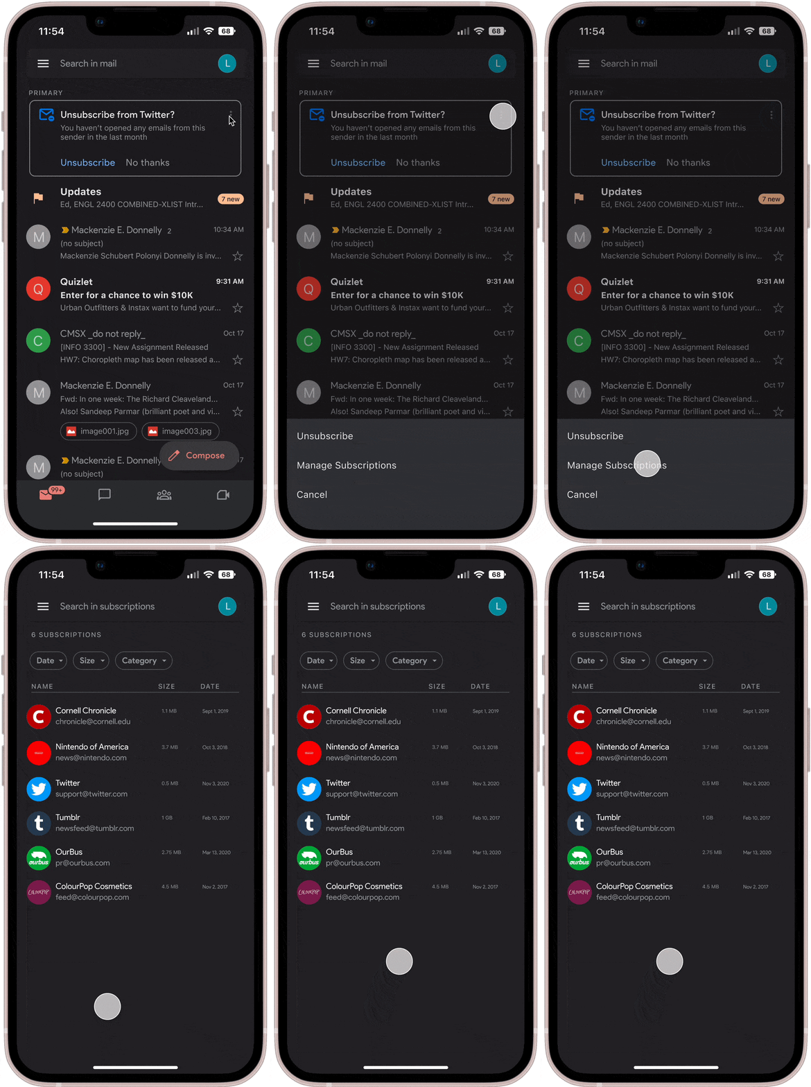
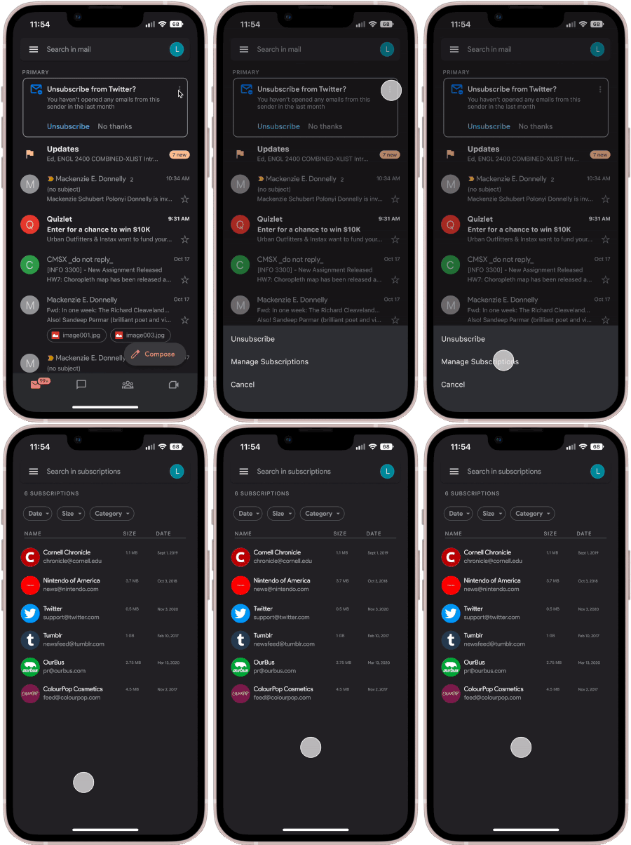
In this flow, the unsubscribe box now matches the way it looks in the app. You can enter the subscription page from the 'three-dot' entry point that is found across other Google products.
Gif showing how to enter the subscription page from the unsubscribe box. Cursor taps the top right corner where a popup appears at the bottom with options "Unsubscribe" "Manage Subscriptions" and "Cancel". Cursor then taps "Manage Subscriptions" which leads to the subscriptions page.

Analyze Results

User Testing

After testing the prototype with three different users, there were some minor changes made.
  • Subscription selection bar: Before, the spacing was inconsistent with different devices, and had unclear icons. The category management icon was confusing. This was changed to a simple gear to show that there can be settings changed for subscriptions.
  • Sidebar Entry: My first consideration for the sidebar entry was a dropdown under promotions tab. This was confusing to the users, who suggested simply putting the subscription entry point at the way bottom.
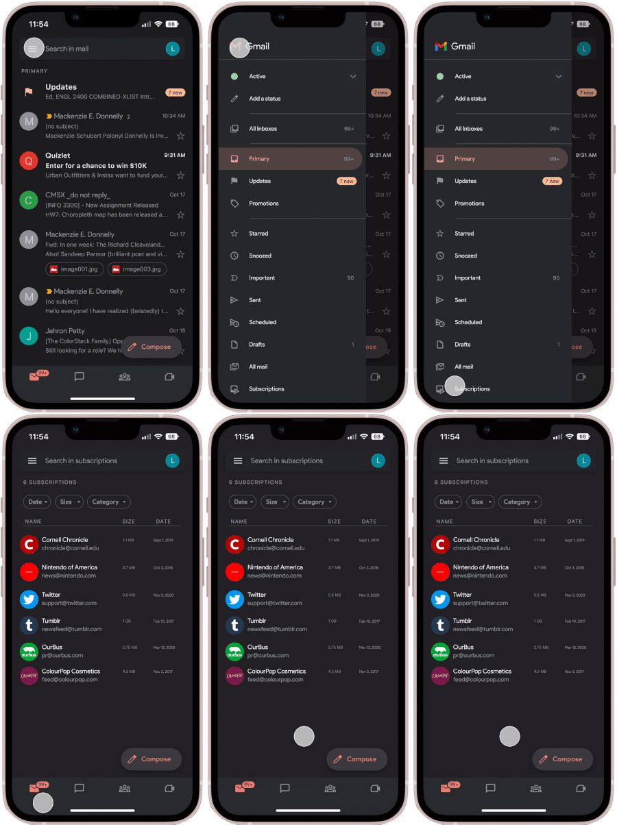
Sidebar Entry: Fits with other email related functions. Moved to the bottom since top links are for entering specific types of inboxes.
Gif showing how to enter the subscription page from the sidebar. Cursor taps the top left corner hamburger menu where the sidebar opens and "Subscriptions" appears at the bottom. Cursor then taps the "Subscriptions" pane at the bottom and opens the subscription page.
Unsubscribe Box: Expanded existing feature by adding "three dot" button on top right, similar to other Google features.
Gif showing how to enter the subscription page from the unsubscribe box. Cursor taps the top right corner where a popup appears at the bottom with options "Unsubscribe" "Manage Subscriptions" and "Cancel". Cursor then taps "Manage Subscriptions" which leads to the subscriptions page.
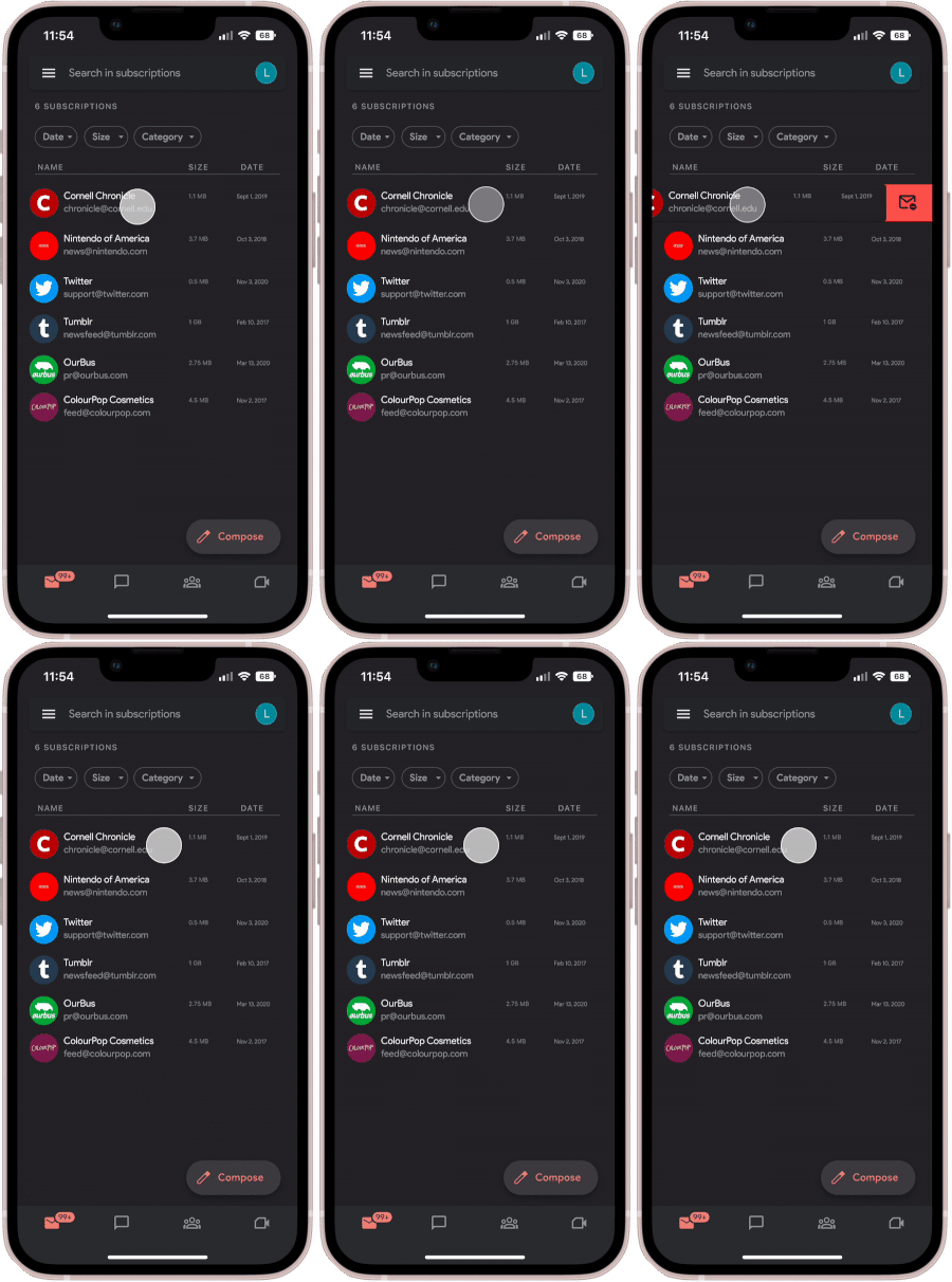
Swipe to Unsubscribe: Swipe a specific subscription the way you would to delete a single email.
Gif showing how to unsubscribe. Page is in the subscriptions page, and a cursor goes over the "Cornell Chronicle" entry, holds it, and swipes to the left to show the option to unsubscribe on the right immediately next to it.
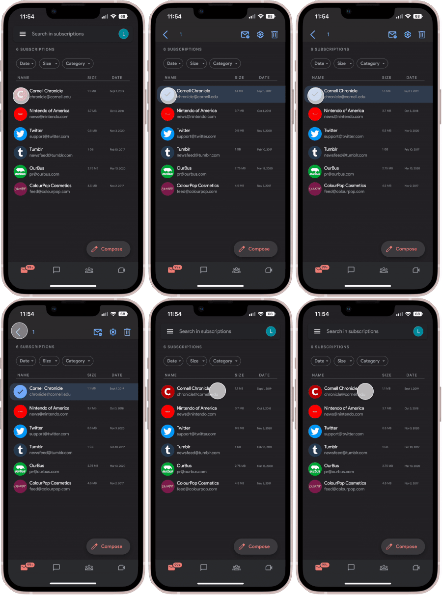
Tap to Unsubscribe: Tap the icons to select subscriptions to mass unsubscribe.
Gif showing how to unsubscribe. Page is in the subscriptions page, and a cursor goes over the "Cornell Chronicle" entry and taps the image for the entry. This prompts the entry to be selected, and the top bar to change to show options to unsubscribe, manage subscription, and delete all emails from Cornell Chronicle. Cursor then undoes selection.

Final Prototype

Considerations and Conclusions

KPIs and Future Features

At launch, these would be the KPIs I'd monitor to consider its success at launch and shortly after:
  • Feature Adoption Rate: Monitor the amount of users who start actively using the Subscriptions page.
  • Inbox Cleanliness Index: Measures effectiveness of Subscription page by calculating inbox decluttering.
  • Net Promoter Score: Observes the popularity of this feature - how likely are users to recommend this feature?
Further considerations would include expansion on category management, and search function integration.

Conclusion

This project was my introduction to product design, and the power of product thinking. I was able to see firsthand how every step was a piece to a larger puzzle, and just how effective design can be as a problem solving tool. I also learned some very valuable lessons from this experiment:
  • Design is a science:
    The stages of product design mimic the steps of the scientific process. Before, I was of the idea that design was mainly for aesthetic and visually appealing purposes. However, I learned that design includes methodical thinking and a process to help create solutions for real problems.
  • Product thinking is essential:
    Understanding the purpose of Gmail helped me address the gap in functionality regarding subscription management. Gmail is meant for productivity, and users lacking control over information reduced the app's efficiency. Focusing on how to solve this issue led to a better user experience, and (hypothetical) email management.
  • Work and adapt with existing systems:
    This feature is part of an existing application. I had to learn how to adapt and create my solutions such that it fit within an existing design system. Although this feature doesn't actually exist, it's still intuitive since it follows the Google design convention.
That was a lot! Jump to top?